Discussions about Apple Vision Pro
I’ve been asked several times about the Apple Vision Pro announcement, so here is the summary of some of the main points that have come up in discussion.
Certainly Apple does design extremely well. Some of the parts of the announcements and demonstrations were very slick, but if you look closely some of the parts were obviously not finished and I expect some features will change.
Hardware (Most of It)
Apple designs nice hardware. There are echoes of several former systems (some of them quite old). There is lots of other commentary on the basic features, such as resolution and field of view. If you want to experience something approaching the resolution touted for the Vision Pro (50-70 pixels per degree), you’ll need to try something such as the Varjo VR3 (70ppd). The Vision Pro panels appear to have a larger number of pixels in total, whereas the Varjo systems have a foveal region of high clarity and resolution (which is lovely to look at!). The field of view has been compared to the Valve Index (a HMD approaching its 4th birthday). The audio is rumoured to be excellent and the tracking is probably state of the art, but it isn’t clear if these are notably different than other current systems such as the Meta Quest Pro or VIVE XR Elite.
Video passthrough is an important feature. Ever since Apple bought VRVana it has been the most likely way that they would achieve augmented reality views. We had ordered the Totem display after I had tried it at the IEEE VR conference. It was excellent – they had custom hardware to transfer the video direct to the display so the latency was impressively low (especially compared to the homebrew hardware we had built). There is now a whole range of impressive video passthrough modes on mobile systems (e.g. Quest Pro again) and desktop systems. At a recent count we had nine different systems doing this to some extent. The best, by far, is the Varjo XR3, and it is unlikely that the Vision Pro can beat that on quality, though it might beat it on latency (12ms latency was mentioned, so approximately 1 frame). We know that there are still effects of latency at that range, even down below 4ms but this becomes a real challenge for frame-based rendering architectures (e.g. see Sebastian’s work), so no doubt there will be more research on this and faster systems (e.g. Microsoft was working on the Prism system when I was on sabbatical there. Some details in this paper about latency of video AR systems).
Eyesight (the External Panel)
The external panel is by far the most interesting aspect of the system. It was mentioned that the HMD can scan your face, then track its movements while you are wearing the HMD and then show your face on the front. The first part is not that unusual, the computer vision and reconstruction techniques have been explored for a while (e.g. see the FaceVR paper and its citations). No doubt Apple will do a state-of-the-art job here, but their goals are somewhat different than, say, Meta’s Codec avatars (see Upload VR’s summary).
The external panel is really interesting. The need for awareness of the immersed user and their expressions has long been explored in HMD design as it is a potential barrier to social use. Sony tackled this one way with the PSVR (with the default being that there is a screen for spectators to watch so that they can see what you are doing), but while mobile systems can support second screens this is probably uncommon in use. It is not always well supported on wired systems as it is up to the client software to generate a view for spectators (or use a network solution).
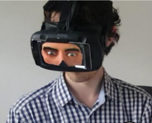
So the basic idea of putting a screen on the outside has been pursued by academic researchers. You can just attach another panel (or smartphone) on the outside of the HMD (as long as it doesn’t obscure tracking sensors). Below is an image from the paper TransparentHMD: Revealing the HMD
User’s Face to Bystanders by Mai et al.
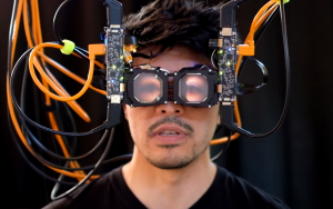
This display has some limitations. You can already see that the image is flat, so it is obvious the face on the display is not facing the same way as the wearer. The most advanced display of this type, is Meta’s research work on “Reverse Pass-Through VR”, where they reconstruct the face and put the eyes of the user on an external light field display.
Why did Meta go to the bother of a light field display? There are a couple of reasons: image depth and apparent direction. A light field display can give the impression that an image is behind the display surface. So to viewers, the eyes appear to be coincident with the face of the wearer. This alleviates the effect that the user’s eyes appear to be in the wrong place. The second is more subtle and is related to a couple of effects of how images appear on flat displays. One is easy to understand: the TV screen turn effect. That is, if you draw a face on a flat panel, as a viewer moves around, they have a bias of seeing the eyes of the user on screen as if they were pointing orthogonal to the plane of the display. This means that two people looking at the screen will not agree on the direction the image of the user on the screen is looking. The biases are quite systematic and would be a real hindrance to communication if the HMD wearer were not directly in front of the person they were speaking to. This has been well-studied, including by us. Below are three systems built by Ye Pan and others, that explore how users in different directions perceive gaze and eye contact with a representation of another person. From left to right, a spherical display, a curved lenticular display and a multi-view display (based on a random-dot style display).
So Apple’s display is most like the middle of these: a lenticular display. This is a very practical choice since there are lots of lenticular displays available, so a lot is known about their capabilities. They only support one viewing direction though, and a limited number of views. They can produce apparent depth (as you can tell from many lenticular stickers or cards). However, they don’t produce variation vertically, and if the viewer or wearer tips their head over (so the viewer’s eyes aren’t along the main axis of the display) the effect will disappear.
Apple have taken on a real challenge to make this look good. It is the most interesting part of the HMD by far. I suspect that the reason Tim Cook and others weren’t filmed wearing the display is that the reconstruction and presentation is not looking as good as they want yet, and if you were to film a very recognizable person, the limitations would be much more obvious. Whether limitations matter in practice for the purpose they intend (local collaboration) is a different issue, but it is a feature that will not be easy to represent on images or videos of it.
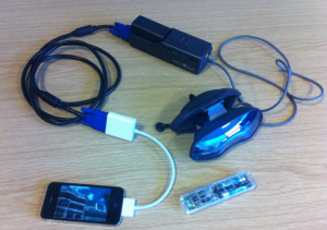
Finally, on this aspect: the dial. I like dials. Dials are under-appreciated in HCI in general. The Vision Pro has a dial to blend between AR and VR modes (and between Eyesight modes). There is one other display in our collection with a dial, and it is very old: the Sony Glasstron PLM-S700E (circa 1998). I am still surprised that no company has taken this approach to a mixed AR/VR display. They solve the viewing awareness problem, by having the display out of the way of the wearer’s eyes (thus viewed through a half-silvered mirror) and then the external surface is an LCD panel that can go partly transparent so it becomes an optical AR display. It has a dial on the battery pack (which you would wear on a belt); I did say that there were echoes of past displays. The image below shows a fully mobile VR display we made with the Glasstron.

Sony Glasstron plugged into an iPhone making our first portable VR system (demoed at Mobile World Congress 2012!). The dial is very hard to see, but is on the top-right of the near side of the battery pack. The shiny outside of the HMD (which is very small and light, but narrow field of view), is a screen that can be switched from almost opaque to partly transparent.
Software
Apple has the advantage that it has lots of users that are familiar with the basics of its existing interfaces. They showed a panel with icons that looks like a transparent tablet with circular icons. It might be just me, but this looks quite dated these days, and no doubt widgets will come. Most other platforms have moved to a more media centre-like or console model with large panels with animated previews. Circular icons, clearly separated might make for good eye-tracking demos, but the edges of more packed displays will be challenging. This interface has already been simulated by others on existing displays (for example).
There was lots of polish to the software, but again nothing particularly new. They have excellent spatial scanning so support local awareness. It wasn’t clear what they were doing for a guardian system. I may write more about these separately, but otherwise what they showed is somewhat reminiscent of Hololens’s approach to pinnable apps and volumes, versus fully immersive.
Possibly the most interesting aspect of their software will be how apps will be published on their store. Their app model for iPhone/iPad is very different than the prevailing curated store model.
Overall, it is a very exciting package of XR functionality. No doubt we will get one and start to port our demonstrations and tools to it.


